Over 1M Posts • 84K Topics • 9K Authors

Played around with creating a new 6GC Logo today - 6G Celicas Forums

Topic #38389 42 posts Started by Coomer
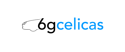
I'm considering redesigning the 6G Celicas logo for use on the site.

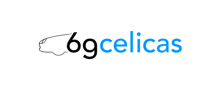
A new logo would have to be vector-based primarily for use both in print and on a computer screen, and I want something simple yet classy.

I messed around in Fireworks for a while today and here's what I ending up coming up with. There are a few different examples. Let me know what you think. smile.gif


Attached image(s)
Attached Image Attached Image Attached Image Attached Image Attached Image
 

New Toyota project coming soon...
i like the bottom ones, red stands out the best, maybe a darker blue if u wanted a blue, the top 2 are way to plain imo, and more can be added however u want it so it can be on print, im assumin u mean kinda like a business card, but what about a silouette (sp?) of a front end on the side of the card, and make the text on the right instead of centered.. therefore its got a celica, but since its not a complete render it can be easily printed
Last one looks nice, the additional line makes it stand out more. One suggestion, make GC in caps.

Nice work Coom.

I will return one day.
i think they look alright. i'm so used to the original, but i can't wait to see what you finally come up with. why not get some people to submit their ideas and logos and what-not to help out?

ss-iii splitters and 404 skirts areon. which means i need to update my sig.
I think we should go what celica tech did and have a contest......oh ya! Making the 6GC in caps would be a good idea though for your designs.

Teh Celica sleeps for Winter '06. Suspension overhaul begins........
chris,
imma be the d*ck on this one, and say i dont like it much...there is not enough definition to the car, and the font seems TOO plain.
then again, you know what they say about opinions wink.gif

Former Team 5SFTE pro member ;)13.6@108MPH, 5SFTE Powered
i personally like the thrid one, with the blue backround its hot! Liking the fading lines. But i must say coomer, they all look awesome smile.gif

----- '94 ST hatch --- Yellow -----
I like the last one however I think it is almost too plain. I like simplicity too, but a little less.

Sometimes we live to beat the odds.-Ryanaim: rkgreen04
Agreeing with manny on this one. Font to plain/simple. Would rather see the current/old logo then this one.

JDM Powerplant installed, BPU coming very soon!
put the 6 as a wheel in that car icon
I agree with Manny about the definition to the front of the car.
I agree with Jeff too. I think the "GC" should be in caps.
But other than that I like the last one smile.gif

98 ST204 ZR - Black Beauty - Roaming the streets of Sydney73 TA22 LT - Tiffany Blue - Mint Classic Weekend Cruiser75 TA22 LT - Snow White - Mint Classic Weekend Cruiser77 RA28 LT - Flubber Green - Mint Classic Weekend Cruiser94 MX-5 NA8 Clubman - Red Racer - Looking for cornersWIP Project: 69 RT40 Corona, 2nd WIP Project: 66 RT40 1600s Corona86 Corona RT142 - Daily Driver6GC 4 Life Baby!!!
I like the simple design.

My biggest problem with the logo is that it doesn't have "6gc.net" in it anywhere. (I have the same problem with the current logo.) If the logo going to be displayed elsewhere to bring traffic here, including "6gc.net" seems axiomatic to me.

QUOTE(lagos @ Jul 10, 2006 - 1:55 PM) [snapback]454118[/snapback]i know your trying to do the right thing for your motor, but this is one of those times where you should just trust the guys who have had their swaps for a while and have done a ton of research into this.
I misunderstood, sorry.

This post has been edited by Batman722: Jun 18, 2006 - 11:48 PM

my st205 swapandour Beams swap
There is nothing better then the old Plain logo Chris wink.gif You should start the new one from the old one, old one has almost everything what you need wink.gif

Ex celica owner - just a guy from other side of the pond...Full custom Projects from restoration to performance builds<<<<<< DCw / JDMart >>>>>>>
Hmm...perhaps I should have been more clear. I plan to replace this logo:

IPB Image

with a new one.

I tried dozens of fonts and various capitalizations, and these ones came out the best in my opinion. I know it's simple, but that's what I want for a logo used within the website. It will go well with some new design changes that I have planned.

I'm not talking about replacing the 6GC.net slanted logo used in stickers at this point. That discussion can go elsewhere at some point. wink.gif

New Toyota project coming soon...
#3 for sure! I'm liking the blue as well
ahhh..now i get it..lmao
in that case, i like #3 & #5

Former Team 5SFTE pro member ;)13.6@108MPH, 5SFTE Powered
Now I get it,

Number 5 it is biggrin.gif

JDM Powerplant installed, BPU coming very soon!
#5 woot.gif

~snap

Past: V6 Swapped 6G Celica, E46 BMW M3, Jeep Wrangler TJCurrent: 850rwhp C6 Corvette Grandsport, Gen1 6.2L Ford Raptor
is it possible to see the wordage moved over to the wheel? 6 on top the wheel?

quicky:
IPB Image

can you send me the ia file to play with?

This post has been edited by LewFX: Jun 19, 2006 - 7:33 PM
for logo do u mean like the sticky thing that gets stuck on the car? or just for the website lol cause i thought that would be neat if it was that you put it on the car.

Is this good enuff 4 ya? :D
>>>>>>How about use cursive for the word celica?>>>>>>

Kamikaze eShop 神風 onFacebook
>
QUOTE(XS4lv1Truch0x @ Jun 20, 2006 - 2:46 AM) [snapback]446596[/snapback]
>
for logo do u mean like the sticky thing that gets stuck on the car? or just for the website lol cause i thought that would be neat if it was that you put it on the car.


He's only trying to replace the logo on the homepage.

There are already 6gc.net stickers made, that logo will not change.

Im not thrilled with any of them but I have a very specific taste of very clean things, which is whats already there.

MyFlickrMyeBay_Perpetual Aperture_
i think the celica dragon would look good by the end of the "S"

have the dragon behind the celica facing <<<<<< that would look good.

Is this good enuff 4 ya? :D
I think #5 looks really good!

Former Celica Owner... RIP 08-2007Now proud owner of a 2007 Solara w/ TRD exhaust, TRD FTSB, TRD Lowering Springs & many other goodies...
I like number 5 but im not a fan of the stars - reminds me of snow.

Good work Coomer

Cruisin down the street in my Infiniti...always lookin for my next trip to Sin City
I like #3, I like the white text on a colored background. I think though that the blue should be darkened a bit. Thats my two cents!

GT4WRC.COM
They arent very good lol, but I was bored.


IPB Image

IPB Image